Seizures are signs website
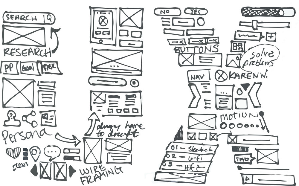
UX, UI, IxD
Project
Create an educational unbranded website dedicated for patients and caregivers living with undiagnosed/under-diagnosed epilepsy/seizure disorder. Focus on helping them identify if there is a more specific diagnosis that might be more accurate for their experience in order to gain access to additional support.
Challenge
The core feature of the website is an 8-question assessment that patients/caregivers answer to then receive a doctor discussion guide auto-populated with their responses to bring to their health care providers for further discussion. Additionally with limited visual elements we were tasked with helping patients and caregivers educating themselves on the three different diseases.
ASSESSMENT DEVELOPMENT
To ensure we created accurate and reliable questions that are appropriate for generating a usable doctor discussion guide for users, we enlisted medical strategists to help provide guidance and background on disease state education, how patients receive diagnosis and how caregivers navigate their journey with them. With their knowledge we created questions related to their family history, origin and frequency of seizures, triggers, occurrence of developmental delays, and usage of any medications for treatment.
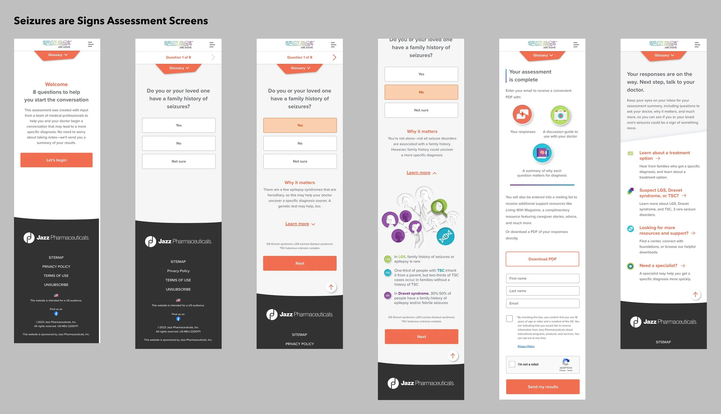
Aiding users with complex terminology
Complex disease vocabulary makes it hard to understand any content, no matter how nicely you design it. Whenever a complex term showed up, we highlighted and linked users to the definition within our persistent glossary.
keeping it engaging
Content-heavy websites with limited design assets make for a challenge on how to keep things visually interesting. No one likes reading through a wall of text, so we leveraged spacing and add fun elements to to help break up content and keep the user going.
One of the elements are the irregular angles and shapes throughout the website. The idea behind the design was to correlate with how erratic each of these seizure disorders are.
The goal was to keep the information hierarchy clean and easily digestible. While also adding transitional elements that worked in tandem with the irregular designs without taking away from the content.
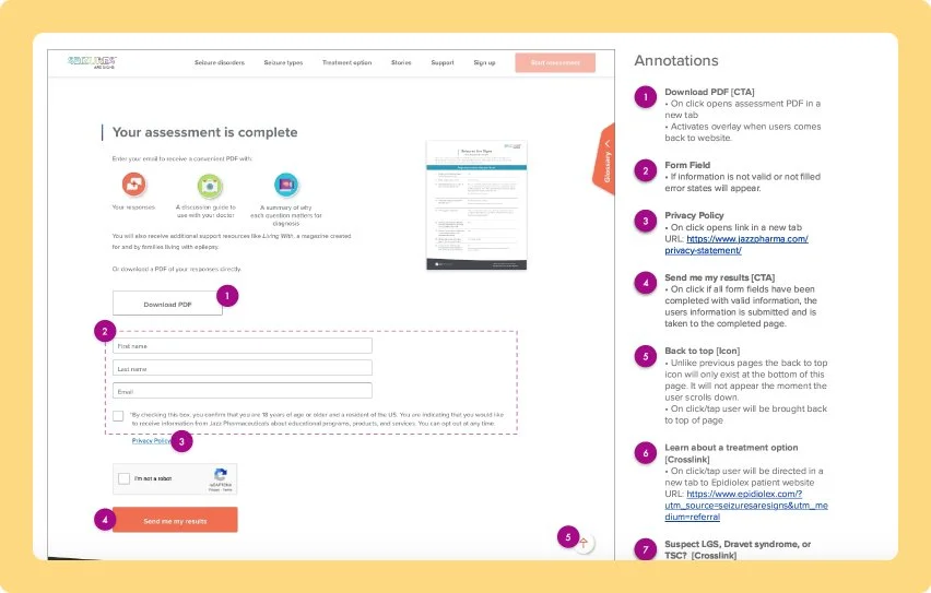
Documentation & Handoff
On completion of the the designs and with approval by clients, I put together an annotation document for handoff. Screenshots and in-depth annotations were made to document out links, interactions and functions across the entire website experience. The documentation was also presented to the 3rd party developers to provide clarity and address any any concerns with the development process.