MyRYTARY Web Experience Redesign
UX & IxD
Tools
Sketch & InVision
Abstract [version control tool]
Project
MyRYTARY is a resource hub for Parkinson’s disease patients to find information on how to save and receive prescriptions for the RYTARY drug. The medication helps relieve Parkinson's Disease patients of their symptoms including shakiness, stiffness, and difficulty moving. Our goal was to create an accessible website that tackled the challenges Parkinson’s patients faced.
BRAINSTORMING Process
Assessment and Analysis of Original Website
At first glance, you can pretty much tell that this dated website needed an overhaul on accessibility and navigation. The outcome of the assessment showed we needed to:
Create a responsive website across all platforms
Include ADA best practices and account for patients’ disabilities
Provide clear and simple navigation
Design a layout that provided maximum legibility and readability
The overall need for creative rebranding and streamlining content
Sitemap
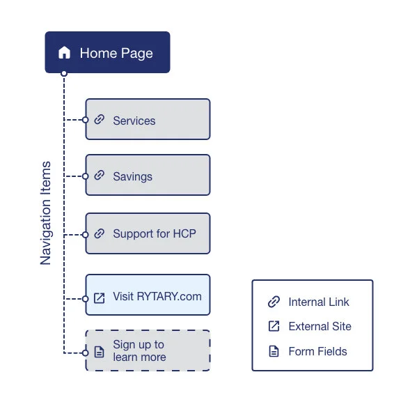
After streamlining copy content with the copywriters and the medical strategy team, we decided that the content was enough to fit on a single scroll landing page to reduce the burden of having to navigate to different areas. Based on our findings, I created a simple sitemap that outlined the overall information buckets and key actions. The sitemaps are only presented to the internal team of creatives and devs to help provide a guideline of how content will be structured.
Design
The best kind of Experience is the kind you don’t even notice
A challenge our users faced was their tremors and shakiness which often caused difficulty when performing even the basic necessities. Applying that to navigating and clicking through a website was something our team couldn’t even imagine. So, we tested our designs with some super-shaky and quivering hands.
The result? It was a frustrating experience to miss the mark on tapping/clicking on buttons and even scrolling proved difficult.
So how do we make it so that the user wouldn’t miss the CTA? Against the idea of creating obnoxiously larger buttons, we chose to approach the idea of “why not increase the clickable area around the buttons?”
The solution provided a discreet way to help out our users without being overbearing in our designs and maintaining a balanced affordance to all interactive elements.
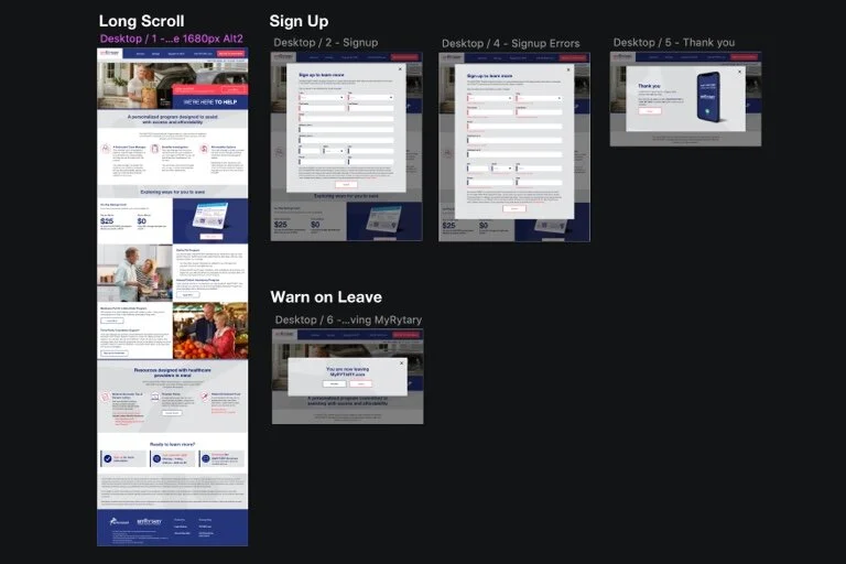
Additional Design Process Snapshots
STYLE guide
Upon completion of creative layouts, a style guide was put together to provide annotations detailing both creative guidelines as well as module components.


